




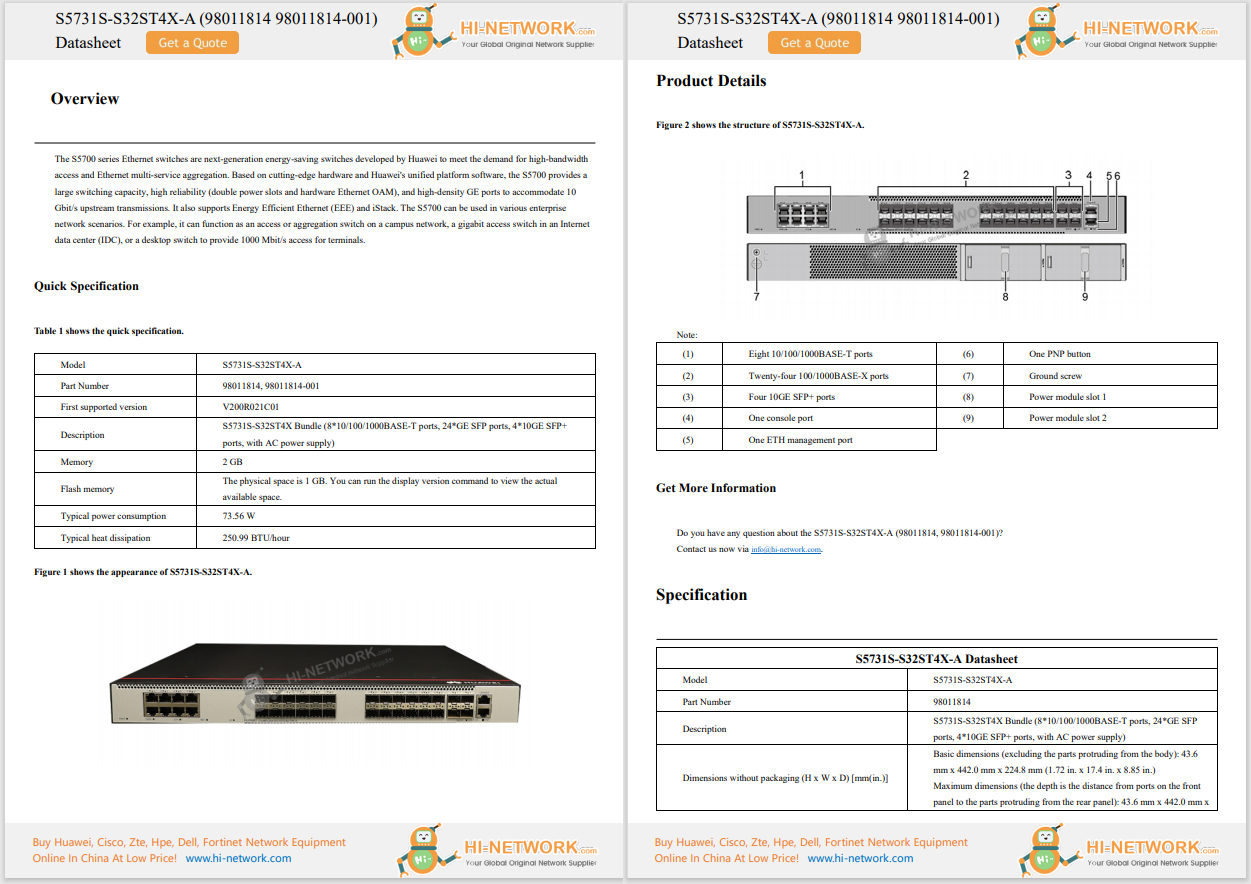








Yes, I just used "cool" and "PowerPoint" in the same sentence. In this case I think that's justified because of a very simple trick you can do to show off long scrolling designs (like most web and mobile pages are today) in corporate PowerPoint (or Keynote, etc) presentations.
A challenge we digital design teams face is that PowerPoint and presentation software, while ubiquitous in giving talks or business presentations, is not really great for showing off most designs - especially modern, scrolling "poster-style" designs, in depth: Either the design is scrunched into a tiny, unreadable format, just so it'll fit, or you do something wonky like use motion paths to have the design flow up the slide like an out-of-control hovercraft.
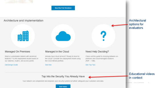
There's a pleasant alternative, however: Use cropping and "push" transitions in PowerPoint to simulate scrolling as you're actually flipping between slides. There's a video demo below, but you can quickly get the idea just by looking at these still slides I pulled from an actual PowerPoint deck about the Unified Access Solution page:




Now, here's a video of what it looks like in practice and how to build scrolling slides in PowerPoint:
You can grab this example PowerPoint file to try it yourself (click the "Download" button on the preview page to get the PowerPoint file). Enjoy!
 Tags chauds:
design
digital experience